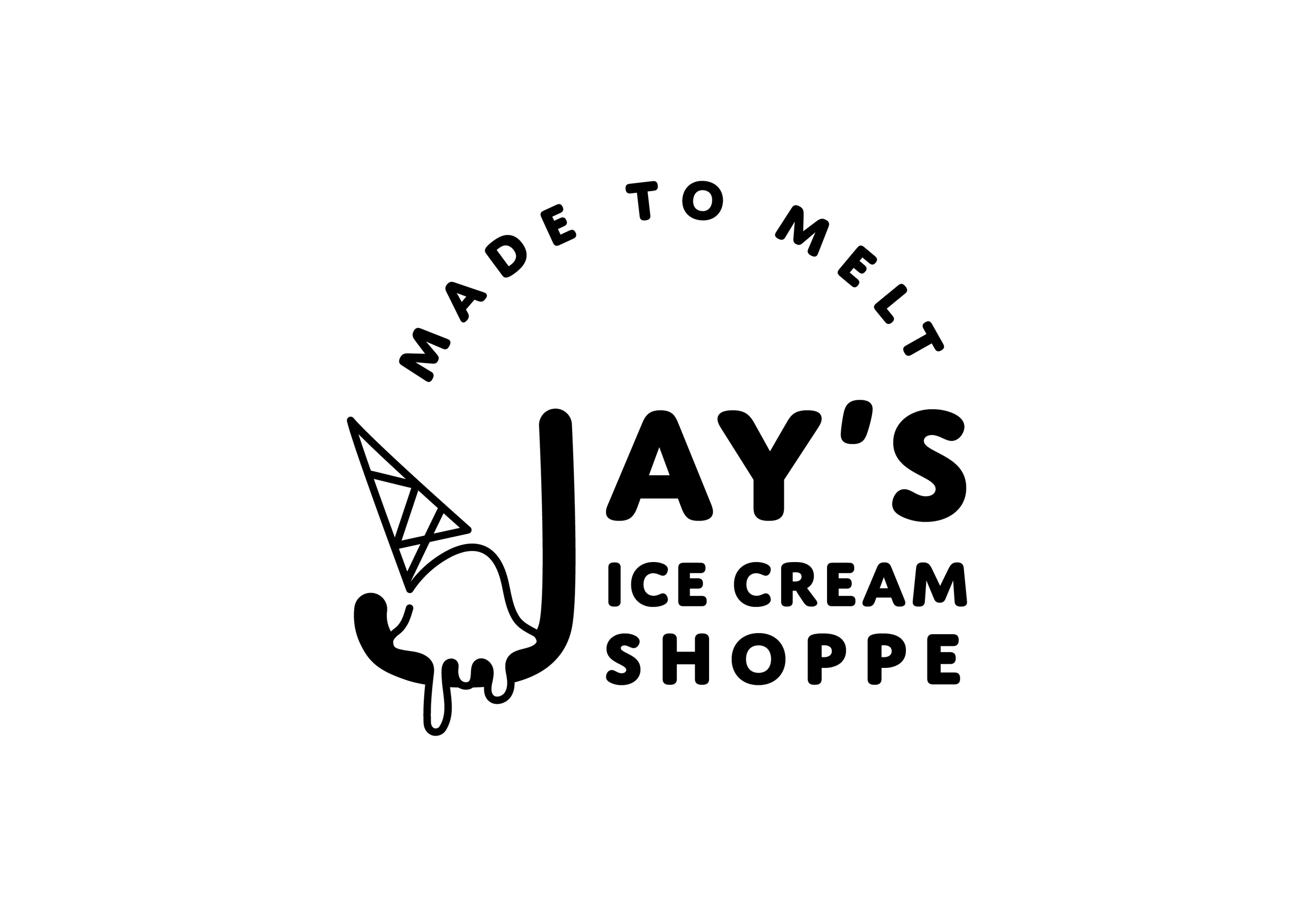
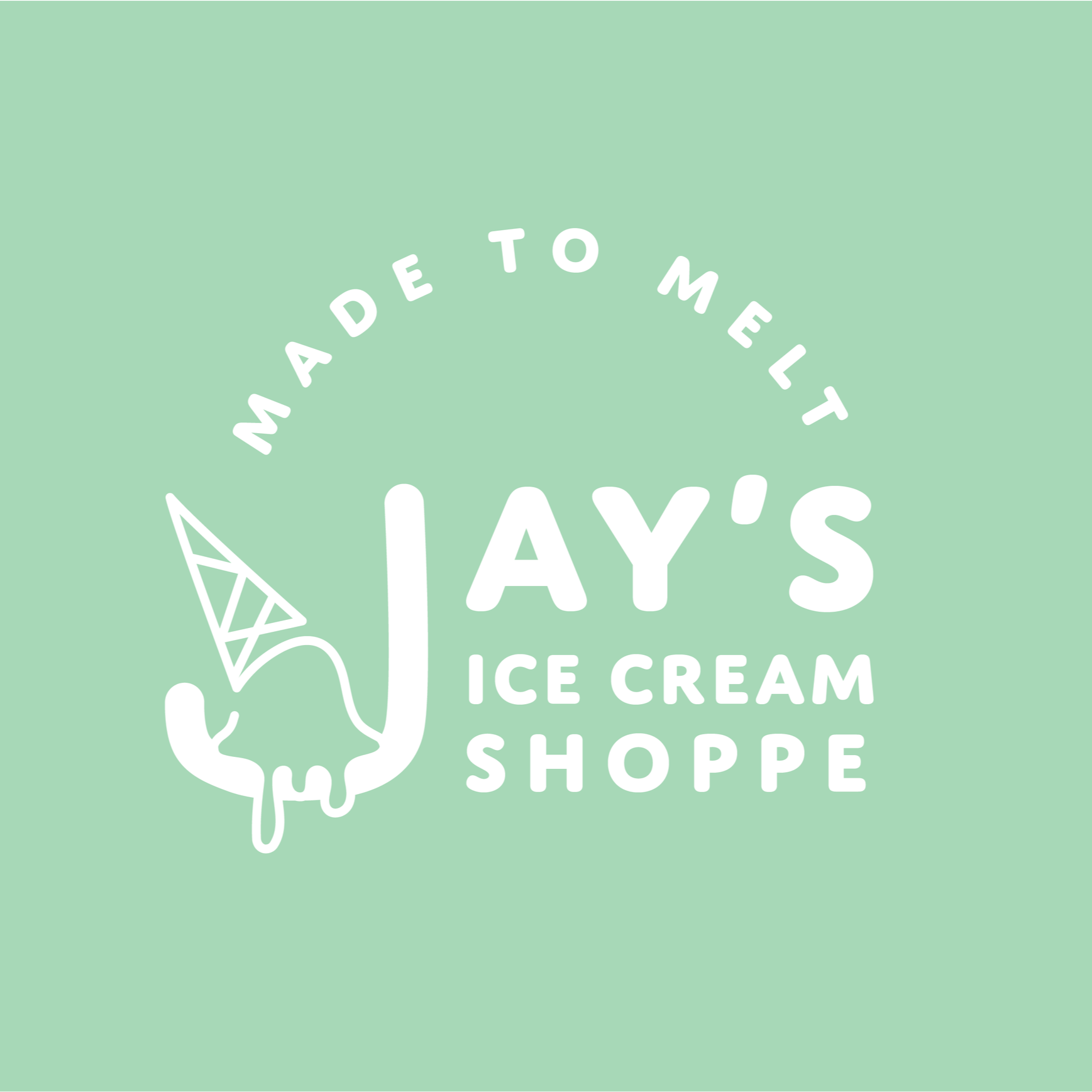
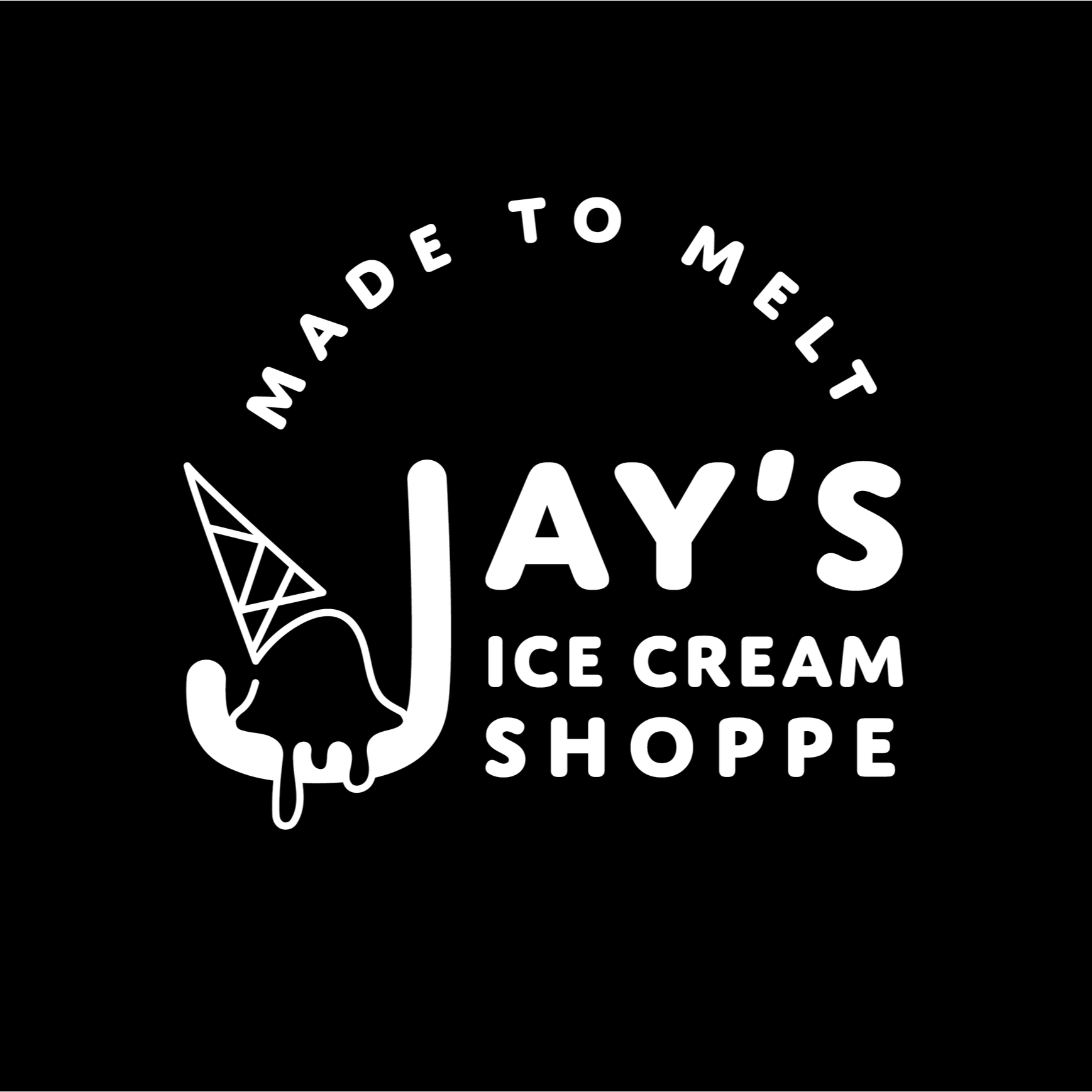
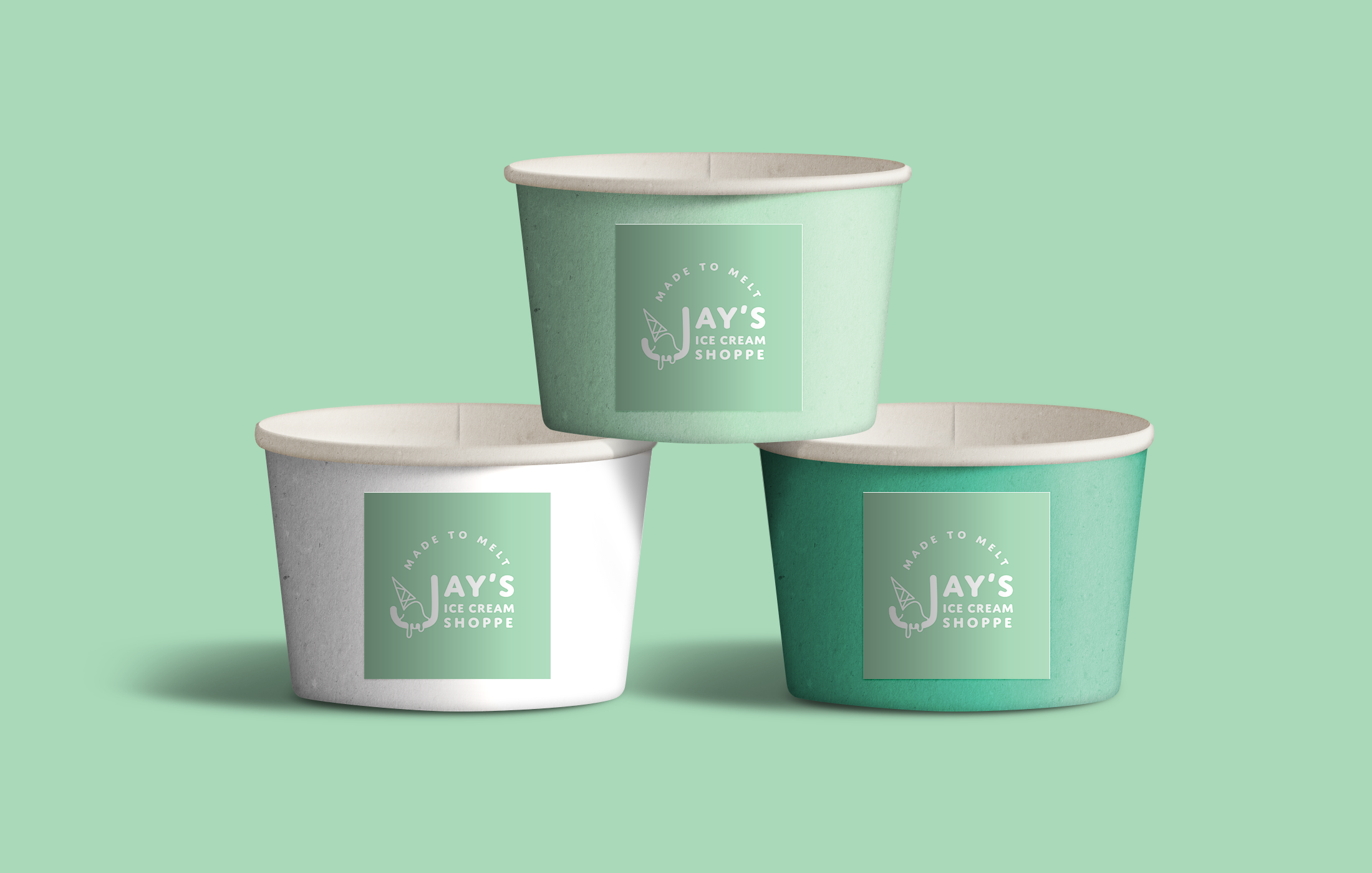
Mock Logo Design
Jay’s Ice Cream Shoppe
A new ice cream shop opening that is meant to be a third space for its community, a large shop that has space for its patrons to meet and gather, and coordinates community events. It specializes in naturally flavored ice cream that is locally sourced. The owner is looking for a logo that is friendly, clean, and approachable.
Preliminary Brainstorming


I wanted to incorporate the idea of a comforting 3rd space logo. Using the J as a bowl for the ice cream, and allowing room for the ice cream to melt furthering the theme of having this ice cream shoppe as a space for the community to hang around for a long time rather than a short time.
Added the catch phase Made To Melt to push that agenda even further.